Data visualisation of Airbnb listings in London
Data | Tourism | MeritProject overview
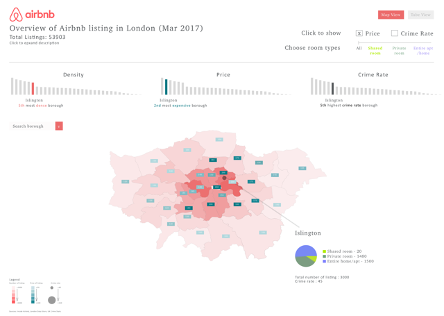
The was a individual project in my MSc HCID course to explore hidden factors when booking accommodation using Airbnb. An interactive data visualisation designed in Sketch and implemented using Processing was produced to show the distribution of Airbnb listings across London, correlated against neighbourhood safety, transport accessibility and price.
Process
User research
Academic research in hospitality and tourism guided me to consider the Airbnb’s broader ecosystem. Informal interviews were conducted with five current Airbnb users to understand their priorities when comparing listings. Besides price, neighbourhood safety and transport accessibility were found to be their main concerns.


Design Process
Copious paper sketches were produced to explore ways to combine information, function, visual form and story within the visualisation, with the aim to inform and inspire users. The hand-drawn diagrams were then digitalised using Sketch. Rapid prototyping in Sketch enabled me to experiment on the utility of the design.


Maps were selected to be the basis of the visualisation due to their strong ability to communicate geographical data. A choropleth map was used to distinguish the difference in price and number of listings. For example, the denser the listings, the darker the shade. Separate bar charts and text complimented the map to provide further detail.


Interactive data visualisation
The design in Sketch became a blueprint for an interactive data visualisation using Processing. Airbnb listing data was aggregated by borough and plot on a map. Users control the degree of focus by filtering factors (price, crime rate, room types) with keyboard or mouse interaction. These additional factors provide users with a way to explore and combine the data with ease.
Here is a video to show the data visualisation with mouse interaction.