Data usage declaration service
Webapp | Fintech | ContractProject overview
Refinitiv (the former Finance and Risk department of Thomson Reuters) is a global provider of financial market data and infrastructure. Its customer base ranges from startups to large corporates like Morgan Stanley and HSBC.
MyRefinitiv is an authenticated space for customers to administer their Refintiv products. I have been leading design in various feature areas such as My Products and Notifications in MyRefinitv.
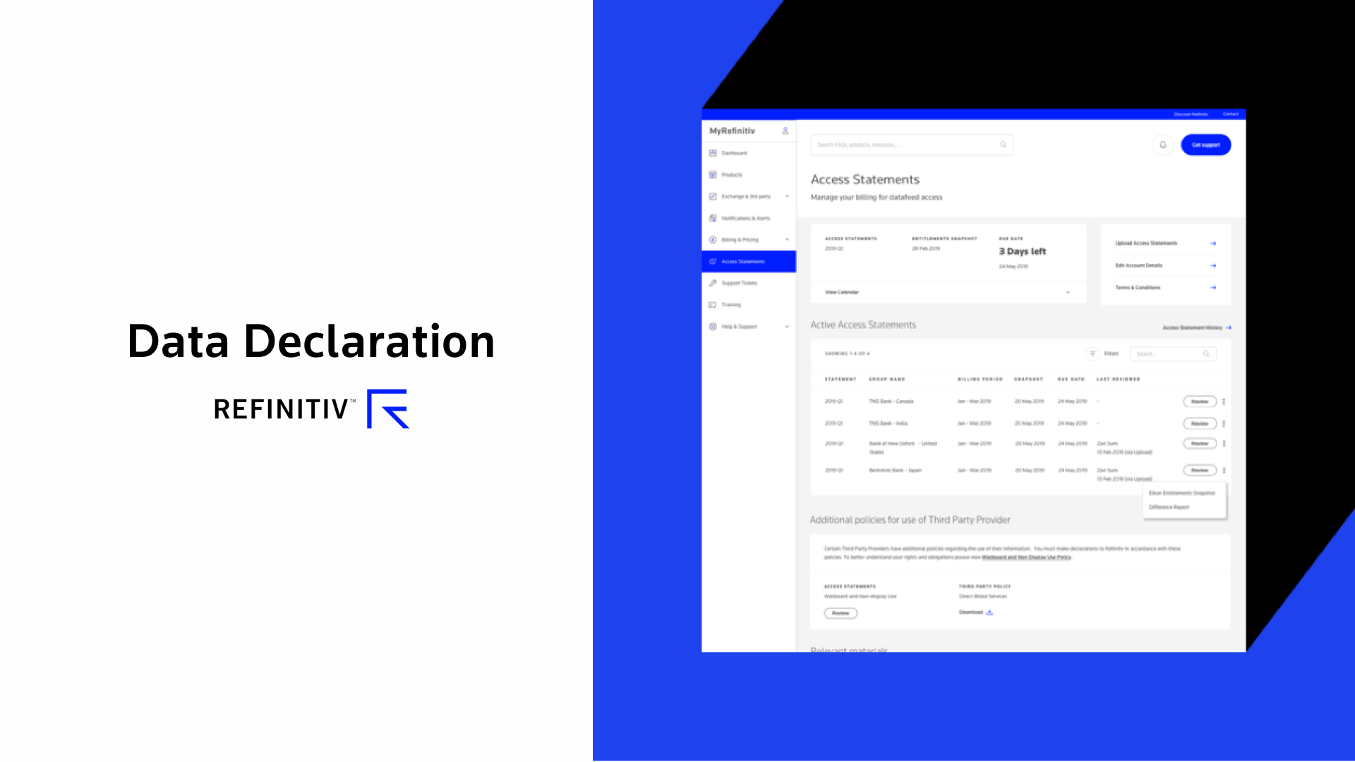
Access statement is a recent feature I have led on. The business goal is to migrate the functionality from a legacy platform to MyRefinitiv. The project followed agile UX methodology. We produced several design concepts in a spike and evaluated the prototypes with customers. We then worked with the technical team to deliver an MVP.
The project was successfully delivered. There are 2000 active users from global financial enterprise such as HSBC and Barclays each month.
Process
Stakeholder meetings
The design team consists of a visual designer, Paul, and I, taking UX responsibilities. We hosted a kick off meeting with the stakeholder in Singapore. I drove the meeting to understand the current user roles, their processes, terminology used and gathered business requirements. I also researched the domain with historic documentation.
Current user flow and Heuristic Review in the legacy site
I drew out a user task flow of the current site and discovered some usability issues. I also documented my thoughts and consideration on each step. My goal was to eliminate unnecessary step and provide self explanatory interface for customers to fill in the declaration easily. Various hypothesis were formed on how might we improve from the current experience in terms of language and interaction with a complex form.


Stakeholders were unsure…
We produced a handful of design concepts in Sketch, with a range of design with clear status bar, obvious fill box etc. In general, we tried to simplify the experience by grouping similar workflows together and keep a focus state on each step.


Unfortunately, at first glance, the stakeholder had concerns with the level of change introduced by the redesigns. The customer support team, who provide training to our customers, were made redundant and were no longer able to provide support to customers with these changes.
However, as we needed to align the design with the MyRefintiiv design system and work in different backend systems, changes were inevitable.
Clear the worries in a short time and low budget
Emphasising with the stakeholder’s worries, we proposed the best way to validate these ideas and discover unforeseeable usability issues was to evaluate the designs with customers.
Although the lead product owner was supportive of this idea, his past experience in user testing was that they were slow and expensive and he was therefore concerned about the development timeline and budget.
I found a solution utilising our resources wisely. Knowing that our customer support teams were close to the customers, we quickly drafted an evaluation plan and asked them to help in recruitment. They managed to produce a list of consented customers in a few days! We then arranged the customer evaluation sessions via Calendly. I also invited a fellow independent designer to be the facilitator of the sessions to avoid any bias.
Meanwhile, Paul and I put together two interactive prototypes in Invision. The first prototype introduced the fewest changes whilst still conformed with the design system. The second combined a number of hypothesis’ on improving ease of use. The reason why we did it this way was to validate if customers also had the similar "no change" mindset as our stakeholders and to see "Is it that bad if we don't make any changes?". We did not want to change for the sake as a "design best practice", but for the customers' pain points.


I planned the research guide and coordinated the design evaluation sessions in one week. Two pilot tests were conducted with the customer support team to spot any issues in the prototypes and scripts.
Design evaluations with customers
The evaluation goals were to understand where the customers expected to find the feature (navigation) and how might customers interact with a complex form intuitively (interaction and language).
A wide range of different customers took part in the design evaluations, from new users to experts, American to Indian, from medium size companies to large corporates. Despite being a diverse group, their opinions were unanimous.
You see the now and was. And the difference is 1. It's better than the first one. Because you have fewer number. It's better than the 5 columns.
Our customers found it easier to interact with the new concepts because they were able to intuitively use the new workflows and search feature without explanation. Some of our longstanding customers also appreciated that we were able to present the same level of detail provided by legacy system, but in a cleaner and easier to use way.
These evaluation sessions helped us and the business to understand customers’ usage of MyRefinitiv in their everyday work.

We documented our research in the research platform Auerlius. It followed us to generate key insights and share them with the wider design team.
Design iteration to fit customers' mental model and workflow
We learnt even there were more columns, they were essential to compare to previous declaration because customers required business justification for any changes. Therefore, instead of changing number of columns, we renamed the columns as customers suggested and made it easy to understand what customers' next step were.
We designed thoroughly in the entire workflow. To facilitate the declaration process, we also redesigned policies pages and grouped relevant terms and conditions, documents and procedures in a logical way.
Business and technical team alignment
We gathered key insights and presented them along with our design recommendations to our stakeholders. With the help of customers’ voices, the stakeholder became confident in our design and deemed them not as disruptive as she first thought.
To balance out technological effort and increase in business value, we constantly collaborated with architects, frontend developers, backend developers and Salesforce developers to plan a smooth rollout with the least development time and budget. After many discussions and iterations, we reached a consensus to deliver a MVP solution, followed by staged future enhancements. This feature was successfully built. There are about 2000 active users now.

Challenges
Design for expert users
The legacy site was designed for customers who have a deep understanding of financial terminology and required customers to work in a very specific workflow. It had a steep learning curve that needed to be tackled.
Customer support team made redundant
The dedicated customer support professionals that were assigned to each customer to train and support them were no longer available. Therefore the user interface needed to be intuitive for customers to self-serve.
Dispersed content
Call to actions, instructions and legal disclaimers were disorderly presented in different parts of page. The content needed to be reorganised meaningfully.
Technical issues
We had limited time and budget to build extra functionality onto an existing data table. We therefore needed to compromise on ease of use vs development effort.
Stakeholder management
Stakeholders expected few changes in design and development as they wanted to avoid retraining customers and changing existing processes.
Takeaways
Understand the customer journey
A great understanding of customers’ holistic workflow helped us to design a seamless experience for them. Sometimes customers voiced pain-points (unrelated to the UI) in their journeys which we did not think of.
Best practices may not always work
Customers in the financial sector are used to working with a large amount of data that’s presented in a tight space. They value information more than white space.
Customers’ voices are the best conviction
“Customers might think / feel…” The best way to validate this assumption is to ask customers directly and invite stakeholders to listen to the conversation.
Designing a table is complicated
A table might look simple, but a generic table that works across the whole organisation is complicated. Work closely with developers to understand their challenges.
Designing for repetitive work is different from a one-click experience
The design needs to be easy to interact with and communicate clear feedback of the interaction between users’ actions and system state, such as loading and failure.