Thomson Reuters E-Commerce digital transformation
Website | Legal | ContractProject overview
Historically, Thomson Reuters' legal solution sales process was heavily manual and involved negotiation in person and by phone. The goal of this project was to create a digital experience for customers to try, buy and renew their services online. My responsibility focused on two new customer purchase journeys — Practical Law and West Law — from plan selection to payment. The project generated more revenue than predicted after launch and drove more than $10K revenue in 2 months.
Process
Requirement gathering and setting up design goals
Before I joined this project, there were 2 other lead UX designers — Irina and Natalia — who'd already organised multiple workshops with stakeholders including the proposition, marketing, customer support and development teams.
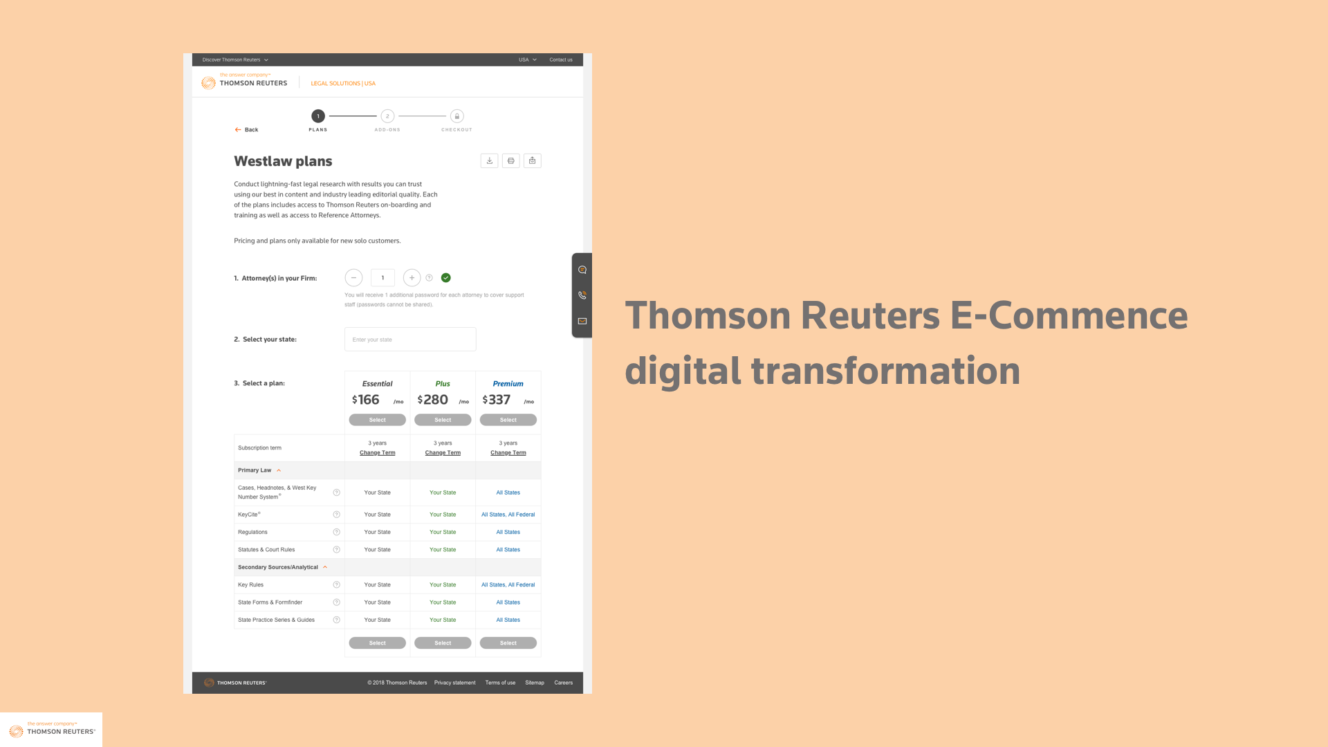
A high-level service blueprint documenting customer statements (e.g. "As a decision maker, I want to see clear pricing options") and existing pain points were produced, along with key persona. The project was then split into three main divisions: new customer, renewal and trial journey.
Irina and I focused on the new customer discovery and order journey. I took the high level customer statement and iterated on detailed content requirement and interaction flow between each persona.
For example, end users for our service were attorneys sitting in the legal department in Texas whilst the procurement manager who approved the project budget was in the headquarters in New York. Our design fitted with customers who just glanced a high level overview of the plans and prices, also end-users who required details. The easy share and export functionality reduced the time and friction between internal communications.

First customer validation
In order to test our design with customers, we created the first prototype in Invision and worked with researchers to draft the research questions. The main goal was to test the usability (easiness to add number of users, differentiation between 3 plans and intuitiveness to place an order).
The SUS usability scored more than 90 and passed the benchmark in the industry. However, there were four key areas of improvement:
- Provide clear pricing upfront
- Elaborate difference between plans
- Add ability to change the subscription term
- Display detailed payment condition (is it monthly payment, how the recurring starts etc.)
New team dynamics
Since Irina left the project, I partnered with visual designer Stuart to continue the design process. The business owner and technical team leads also changed. The team required some time to calibrate the new team dynamics.
I think it should be…
With a fresh pair or eyes, the design was viewed differently. While the direction after user testing was in still in the air, we were asked to deliver alternative design in a short period of time to meet the development timeline. Although we all located remotely, I could still feel the heat from discussion.
The best way to mediate an argument on the subjective "What's better?" is to get actual customer feedback. We persuaded the business to test these ideas, with additional design improvement from the first round customer feedback. Stuart, the visual designer and myself rapidly explored all options with pencil sketches and digital Sketch. I churned the customer and business feedback, investigated the best-practice in e-commerce and presented to the business about pros and cons of each design. After discussion, we ultimately crafted two most desirable approaches into Invision prototypes and proposed the hypothesis for the next testing.
The hypothesis were:
- Was progressive disclosure interaction better than multiple-page interaction for exploration of plans and adds-on?
- Was progressive disclosure interaction better than multiple page interaction for checkout (customer information, payment and confirmation)?


Judging from the usability score and qualitative feedback, progressive disclosure for the information page worked better because the adds-on could be easily skipped without clicking. In contrast, customers preferred the multi-page checkout process because the status was clearer and had more focus on what they needed to do in each stage.
Design iteration, development and knowledge sharing
After the business, design and development synergised on the customer research findings, we reached an agreement on the final happy path. I created the user flow and annotated the interaction.

The crucial step of this journey was payment. We knew that every bad form fills led to a risk of customers abandoning the journey. We designed particularly around the unhappy path such as validation errors and payment system connectivity failure with contextual explanation and guided customers smoothly to the next step till confirmation.

Success and knowledge sharing
After launch, online sales exceeded expectations and it was showcased in the all-hands meeting. Everyone in the team was very excited about its success.
We hoped to share this knowledge and helped other business divisions to build on our success. I gave a presentation to the business owners on how to create customer journeys and how to elaborate customer values from the journey map to user interface.
Challenges
Design for global customers
Our thinking was based on how we interact with the world ourselves. However, we should be mindful of how these interactions might differ around the globe. Take address validation as an example: zip code is a compulsory field in the United States, while United Arab Emirates do not use zip code at all. When the team suggested to use zip code to validate the authenticity of the customers' companies, we required an alternative method.
Know the audience
As an attorney, attention to details is vital
This was a quote from the customer research. The legal professionals are trained to see through details and seek for require clear explanation. They also pay great attention to contract terms and policies. In order to gain their trust, we strived for a balance between the clarify and amount of these information and visual appealingness of the webpages.
Takeaways
Have we got your answers?
"Is tax included?", "Which tax is included (Federal or State)?", "How can I cancel after 1 year?". These were queries we gathered from the first customer evaluation. We placed tooltips to provide contextual explanation and listed payment terms in bold. There was always an option to contact customer support for more specific issues.
Clear feedback of status and progress
A $300 monthly payment is more significant than a one-off $10 grocery shopping. Customers were more careful as they progressed through the journey so as not to make a mistake. Solid step status and less jumping element (progressive disclosure) was preferable in the checkout to convey a feeling of stability to customers.
Think holistically as a service
Customer service does not stop after checkout. It is the beginning of the relationship with the customer.
How and when can I use the product? Where is the registration key?
These answers were available on the confirmation page, email and FAQ; key places where customers might need them at any moment.