UI Design Challenge
User interface design | Personal projectProject overview
This was a personal project. I designed one user interface daily following a user-centred design approach. More example could be found in my Behance page.


Process
User Research
Literature review helped me understand specific user needs. For example, text for low vision users needs to be high contrast using a large font size. In order to understand the application of design guidelines on different interfaces, I also designed for different devices, not limited to digital but also physical artefacts.
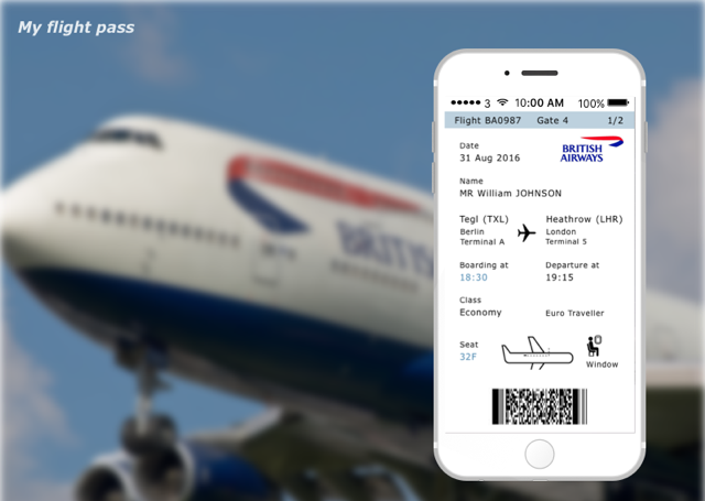
Example 1 - British Airway Boarding Pass

The challenge was to design a boarding pass.
I researched design approaches of different airlines and how design recommendations made by industry had not been adopted.
Inspired by two designers, Adam Glynn-Finnegan and Ivan Boyko, I identified the following problems:
1. Passengers needed to turn their boarding pass to read i
2. The size of the boarding pass is too long, which creases easily
3. Multiple boarding passes confuse passengers with stopover flights


Solutions to these pain points:
Solution 1 Passengers could follow chronological sequences easier via a vertical design and do not need to turn their heads nor the tickets to read its information fully.
Solution 2 Part A is the key information passengers need to know when finding their gate. I designed it to stick out so passengers do not need to reverse their boarding pass each time. This referenced Peter Smart’s design.
Part D of the pass can be folded and torn off when passengers board. Therefor, the size of boarding pass is minimised to fit within a passport.
Solution 3 Part B shows this flight is the first leg of a multiple destination journey.
The mobile app is the same as paper one but without part D. This minimises the differences between digital and paper product.

