Ark
Recommender system | Business | MeritProject overview
This was an individual client-based project during my internship at Thomson Reuters (TR). Its aim was to design a proof-of-concept that utilised TR's vast amounts of data to address the needs of a new customer base.
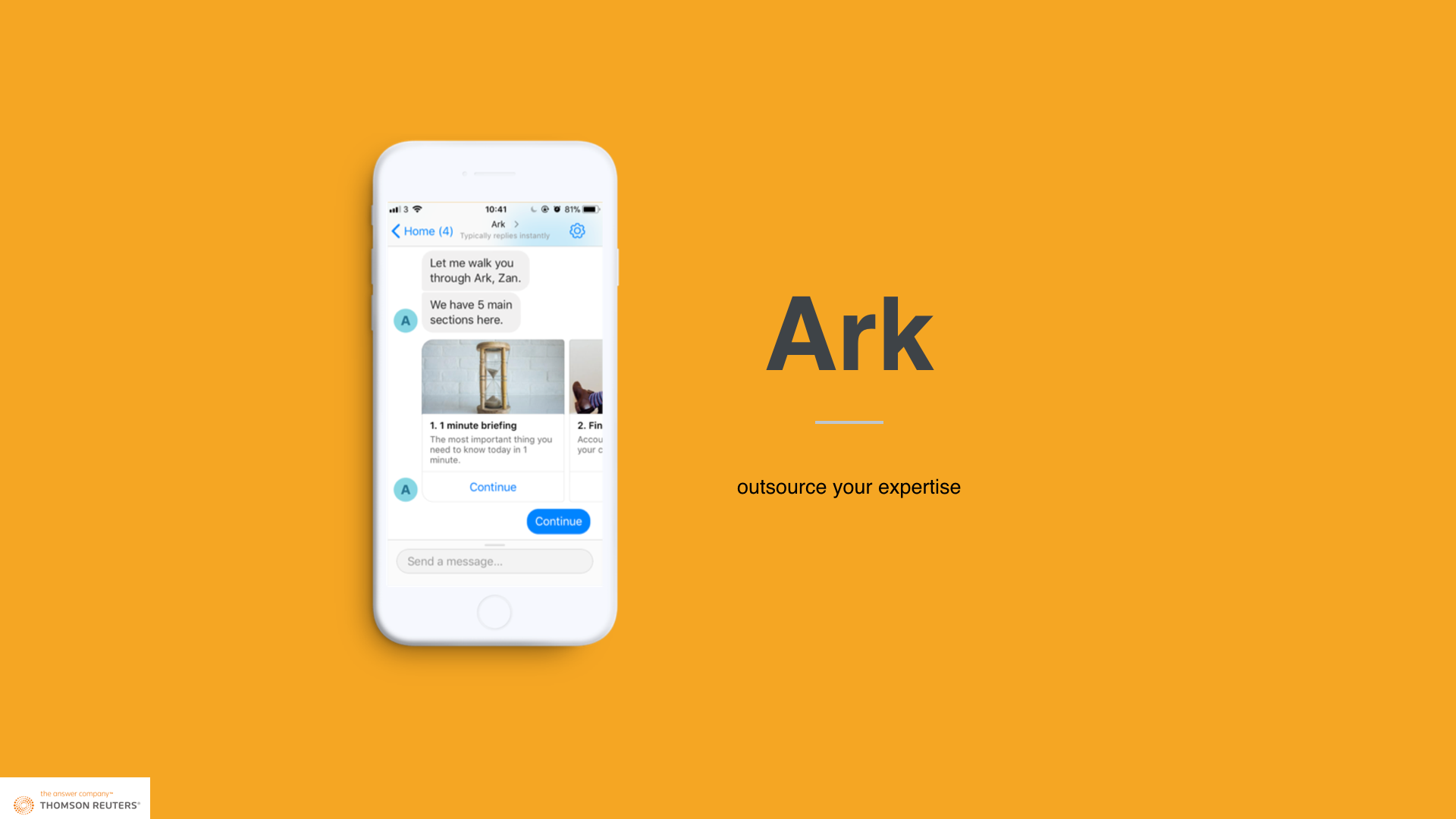
The project focused on the startup community in London. A recommender system was designed. Users interact with a dashboard and chatbot to seek personalised information to inform business decisions.
Process
Approach
The project followed was broad in scope and required a detailed framework to guide the design process. Hence, the Double Dimond design process was chosen because of its flexible ideation phase, leading to a well-defined decision phase.
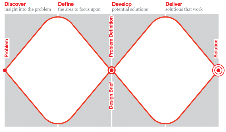
Discover - Multifaceted user research
The project started with a series of user research. A diary study focused on “a week in the life as a startup founder” was first conducted. It outlined the daily workflow of startup founders and how they approached problems.
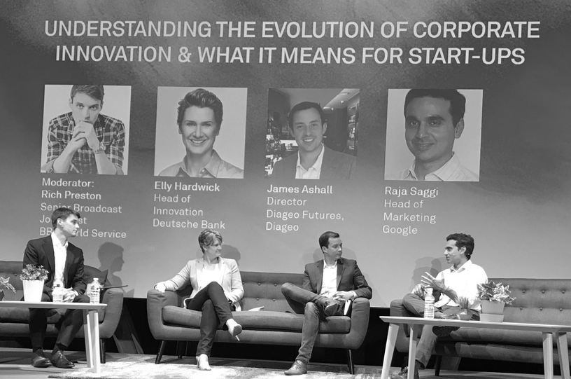
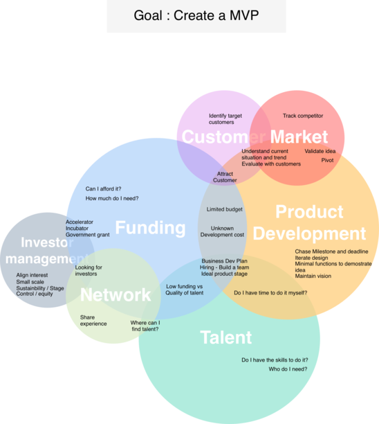
Startup-related events such as global startup conferences and extensive literature reviews provided a holistic view of the ecosystem and the challenges startup founders face at scale. Combing the insight from diary study and these secondary resources, I summed up 25 challenges that startup founders most-faced.
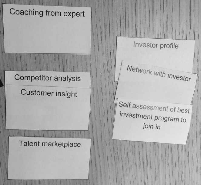
As a minimal viable product (MVP), it was not possible to address all challenges. In order to understand the priority, I conducted semi-structured interviews and card-sorting on the 25 challenges with 15 startup founders, employees and accelerators in London. Participants were asked to filter, sort and group the challenges. They were also given opportunity to write down any challenges were not mentioned, in case any challenges were overlooked.
Define - A problem statement
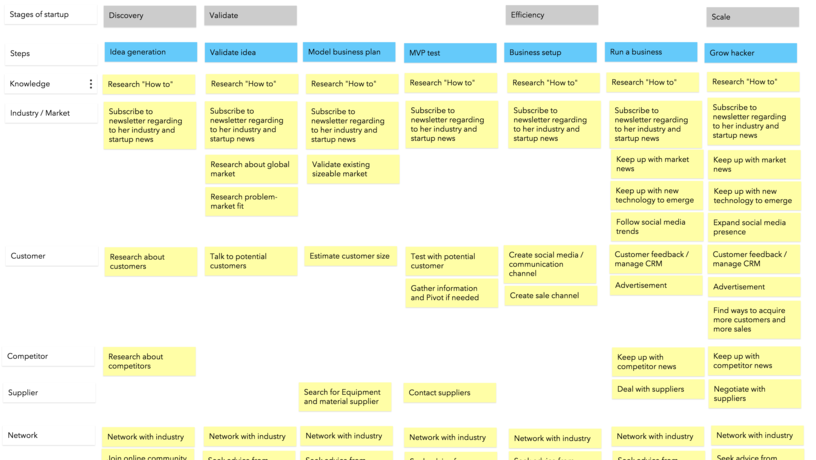
Broadthing was used to categorise user research insights into themes and to create a startup roadmap. The roadmap consisted of goals and challenges of a company formation to its growth.
I also made various visualisation to showcase how one challenge could be overlapped across themes. Startup founders found they lack of personalised information in these themes and it was highly correlated to business decisions and company success.
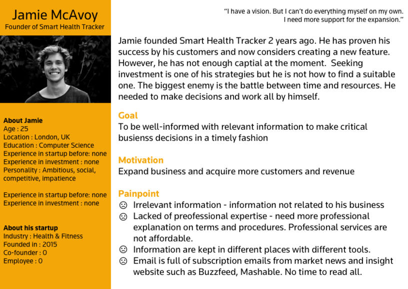
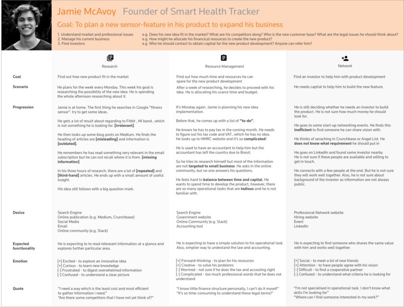
A primary persona and current user journey was created to help stakeholders empathise with startup founders’ frustrations. As an answer company, TR was eager to provide trusted information to the customers.
I started to explore the solution by asking “How might we fulfil startup founders’ information needs?”. Competitor analysis helped me to identify possible opportunities in the industry. A conceptual recommender system was designed with requirements from the user research insights and company brand experience guidelines. It was presented to both business and startup founders to understand if the solution addressed the right problems and fit business needs. 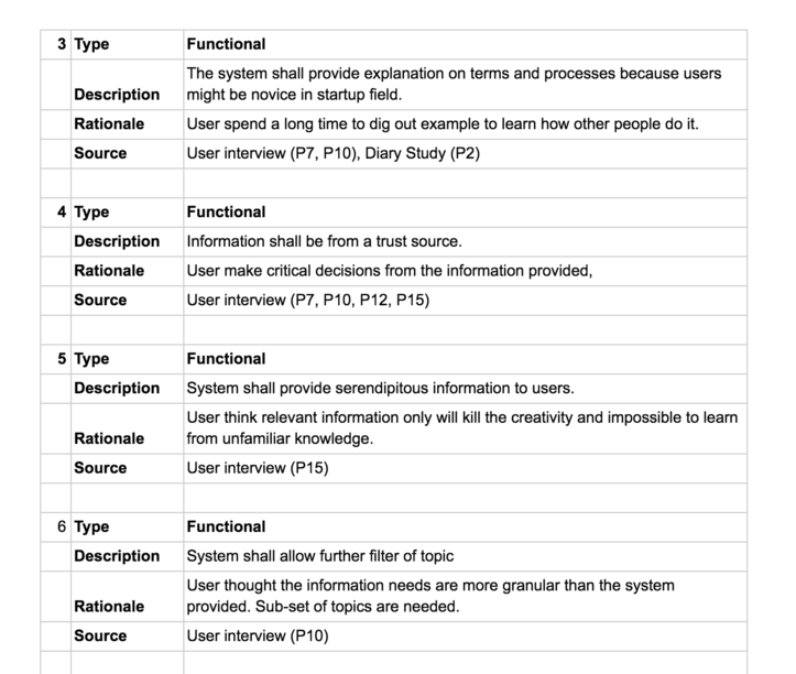
Develop - Interaction design of a dashboard and a chatbot
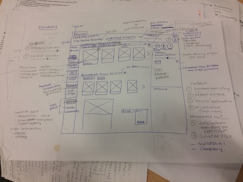
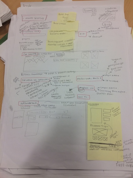
After approval of the conceptual design, I started the dashboard design by creating its information architecture. The rich information recommender system required robust interaction design to make it personalised and usable. I iterated on sketch and wireframe designs via a series of evaluations with startup founders and expert designers. A comprehensive dashboard prototype was created in Invision. The dashboard was personalised through startup founders’ industry, business goal, similar business profile and users’ further interaction with the system.
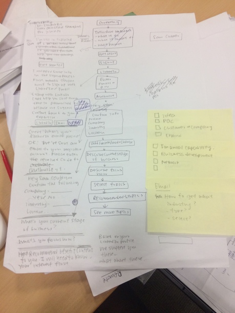
Startup founders often lead a hectic and mobile lifestyle. A chatbot version of the recommender system was designed to help startup founders to be informed from their fingertips. As a proof-of-concept project, there was no technical team. I searched for a chatbot solution that required minimal development and user learning effort. Facebook messenger chatbot was the best fit owing to its simple interaction style and easy development via Chatfuel and other semantic analysis tools.
Deliver - Evaluation and design recommendations
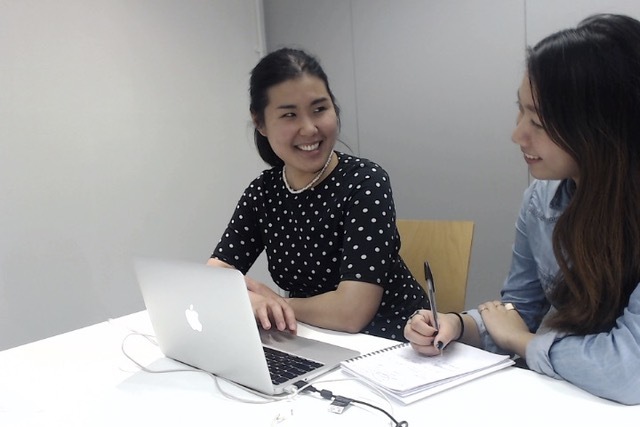
The dashboard and chatbot were evaluated by 12 startup founders with diverse business backgrounds. They were asked to perform 3 tasks from on-boarding, information seeking to change of preference with both prototypes. Qualitative and quantitative analysis were performed to understand their usability and user experience.
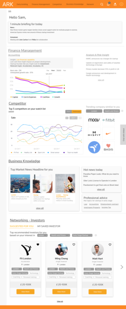
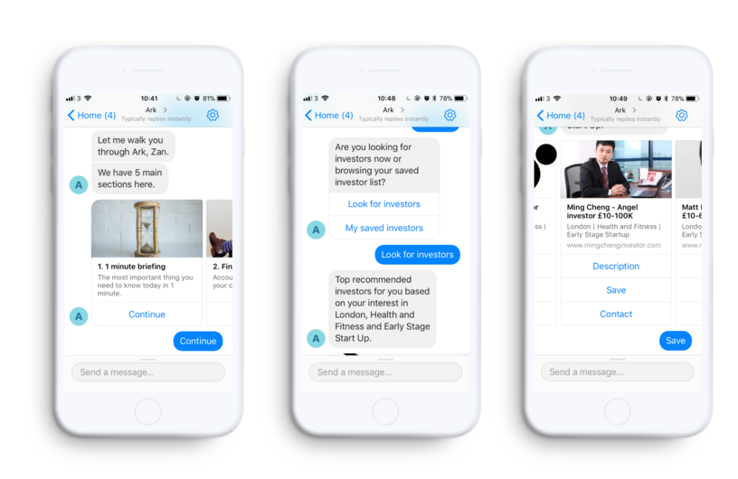
The feedback was positive in general. The founders said it grounded their decisions from its rich and applicable information. The design was said to be thoughtful and easy to navigate. With the trust of the system, one of the founders even suggested to integrate data from his personal bank to provide further insights. There were several constructive suggestions to make the design more valuable.
Building a production-ready chatbot requires a great deal of technical development. As a first step, I provided the business a SWOT analysis on the chatbot and gave design recommendations for future phases of the project.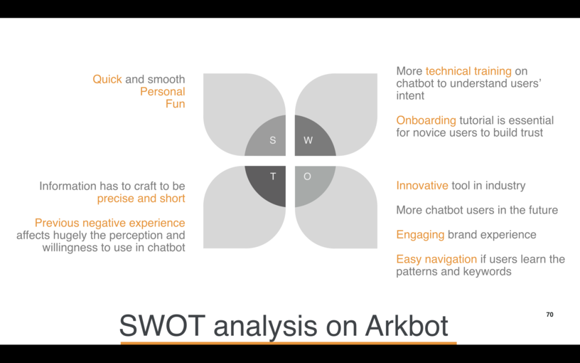
My roles
- User research - observation study, designed user journey and storyboard
- Design - designed smart glasses and vending machine wireframe
- Evaluation - conducted ThinkAloud user testing, completed evaluation report with detailed design recommendations
- Presentation - The work was presented to UXPA China during their visit in Thomson Reuters.
