Artframe
Smart glasses | Art | DistinctionProject overview
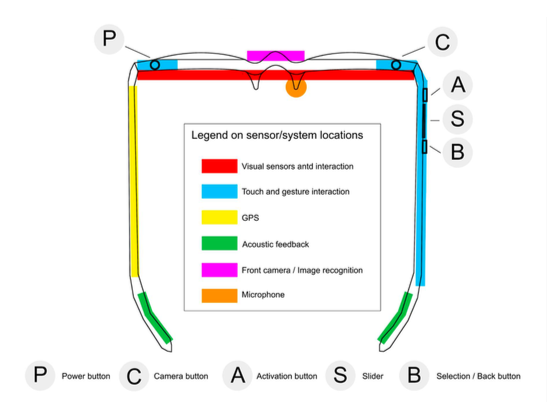
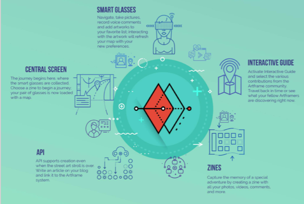
This was a group project to design a digital content creation and curation tool for the street-art community in East London. A wearable device ArtFrame was created to bring a new experience to street-art exploration by augmented reality. An associated central screen is where you get the glasses, customise the route and share your journey.
Process
User research
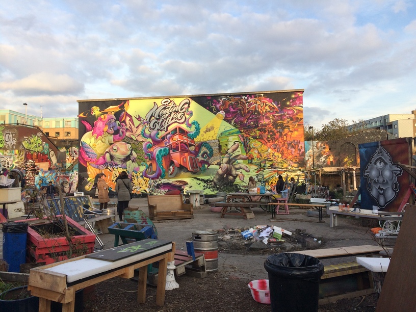
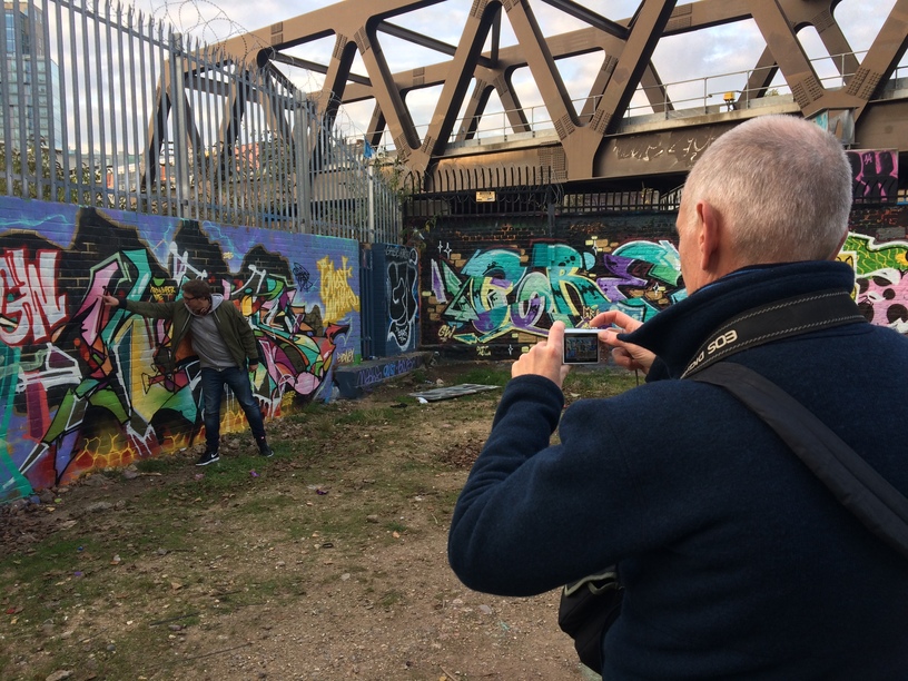
We began the user research by observation, interviews and literature review. We observed participants, mainly tourists, in a street-art walking tour in Shoreditch. We interviewed 13 people who had varying levels of street art knowledge and involvement. The research goal was to understand the street art culture and peoples' activities, behaviours and attitudes towards street art.
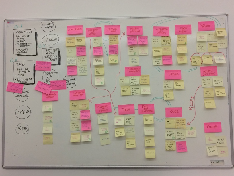
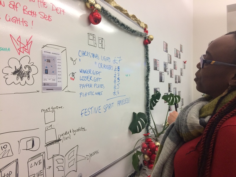
We then gathered all the data and categorised it using post-its on a whiteboard. Through this process, we developed an affinity diagram to understand the relationships between categories. This allowed us to refine the community we design for and the design goals.
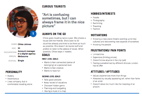
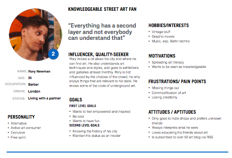
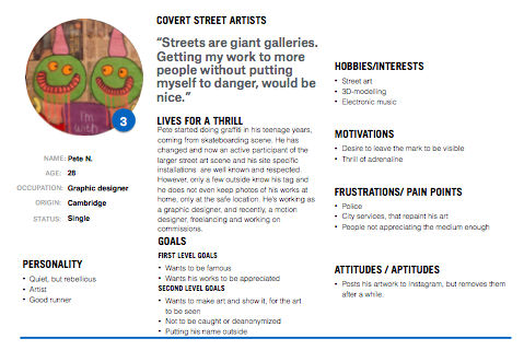
3 personas were developed from the user research. The primary one represented most of the characteristics from the main group of potential users. The goals, motivation and challenges were addressed. We developed scenarios to show when, where and how the story of each persona took place.
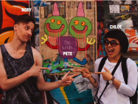
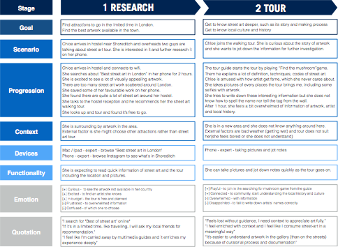
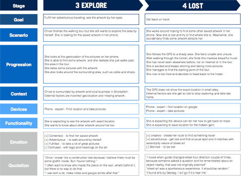
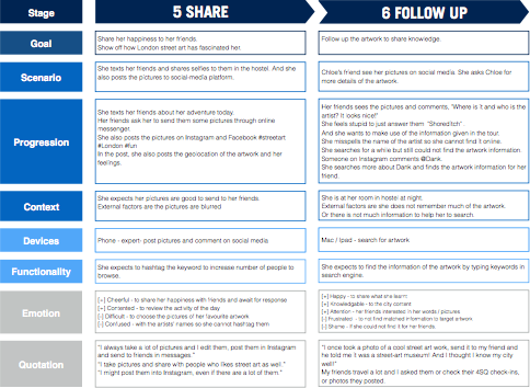
We drafted the the scenarios on a whiteboard, ordered them in sequences and mapped out step by step in a user journey. Our user journey contained not only the progression of each tasks within users’ mental model, but also the devices and its functions users interact with and consequent positive and negative emotional states.
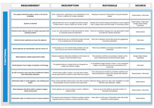
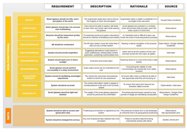
Online management tool Trello was used to help us setting requirements. Two main categories, functional and nonfunctional requirements were explored
Conceptual design
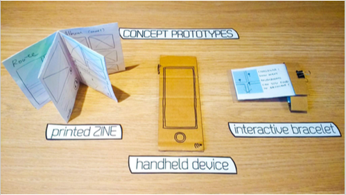
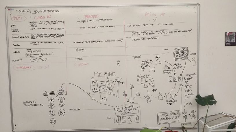
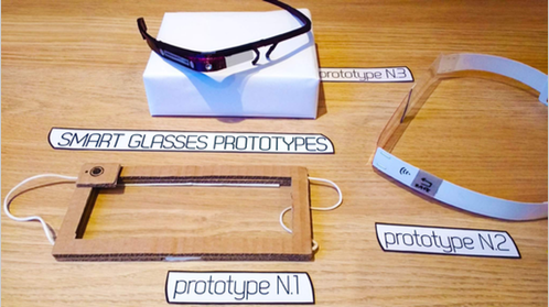
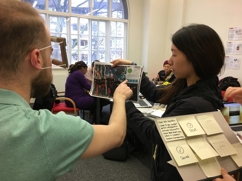
Smart glasses, bracelet and a augmented reality handheld device were generated in the initial design phase. We rapidly produced cardboard prototypes. These alternative designs were evaluated by domain experts, namely a current integration designer and wearable design practitioner.
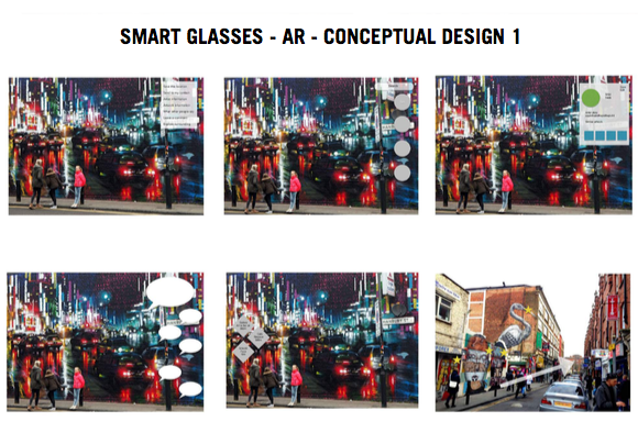
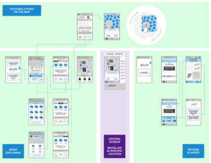
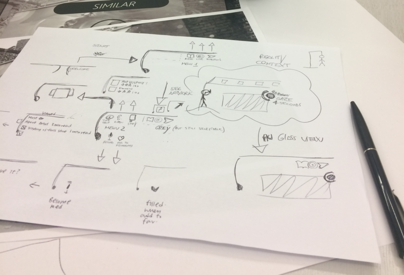
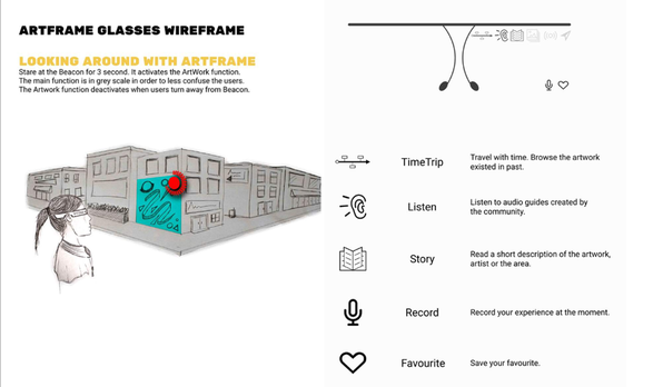
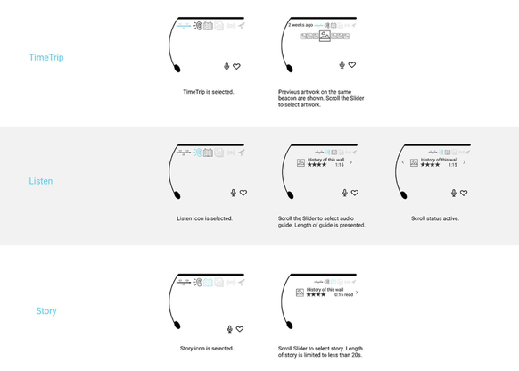
After evaluation of the feedback given, we chose smart glasses for our design. We then sketched some designs and 3D-printed the most desirable design into prototype. We also created wireframes to test the interaction with the device. We used Sketch and Figma to design the wireframe, both individually and collaboratively.
Detailed design
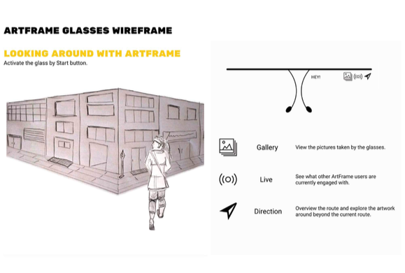
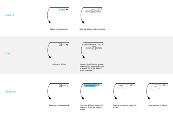
The design process was iterated. Wireframes of Smart Glasses (mobile device) and Central Screen (static device) were re-designed and evaluated. We encouraged participants to Think Aloud during testing; actions and comments were noted and recorded. Usability questionnaires were conducted after the tests. Future user journey and storyboards were produced to illustrate the Smart Glasses usage.
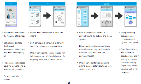
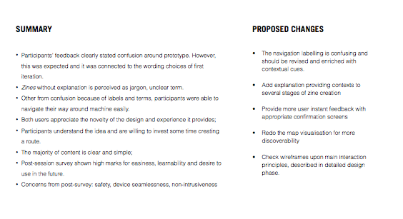
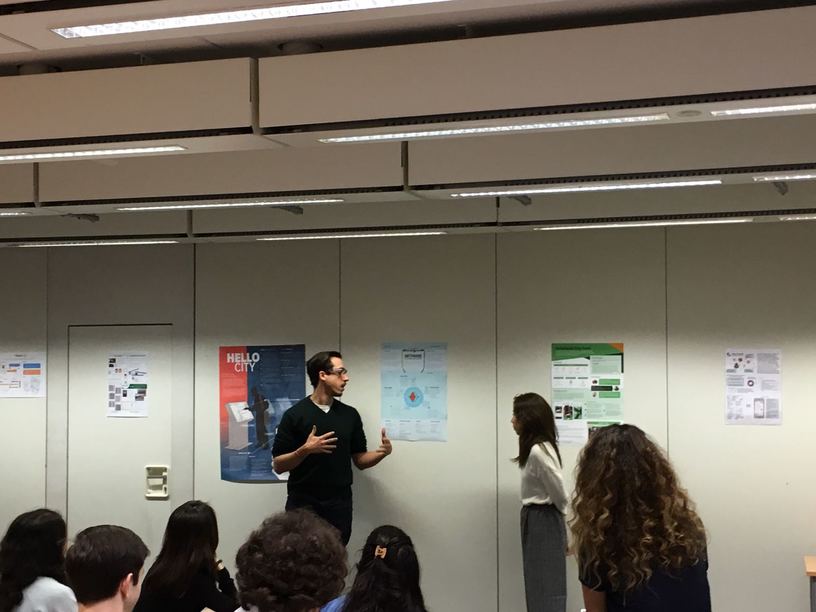
A comprehensive evaluation report was created to identify usability issues and future design recommendations. Product poster presentation was made to share our innovation.
CHI submission
We submitted our creation to CHI 2017. Although we were not chosen, the creation of product video was still a valuable experience to us.
My roles
- User research - observation study, designed user journey and storyboard
- Design - designed smart glasses and vending machine wireframe
- Evaluation - conducted ThinkAloud user testing, completed evaluation report with detailed design recommendations
