London Independent Coffee Roastery
Website | Food | MeritProject overview
This was an individual project to design and evaluate an information architecture in a chosen domain. I designed a coffee roastery directory website for people to find independent roasteries in London.
Process
Domain research
I began the domain research by interviewing two coffee lovers and two roasters. The coffee lovers told me what kind of information they focused on when they searched for coffee roasteries. They also advised me the current challenges they faced during their search. Roasters provided me expert knowledge on roasting coffee such as details on the process and categories within.
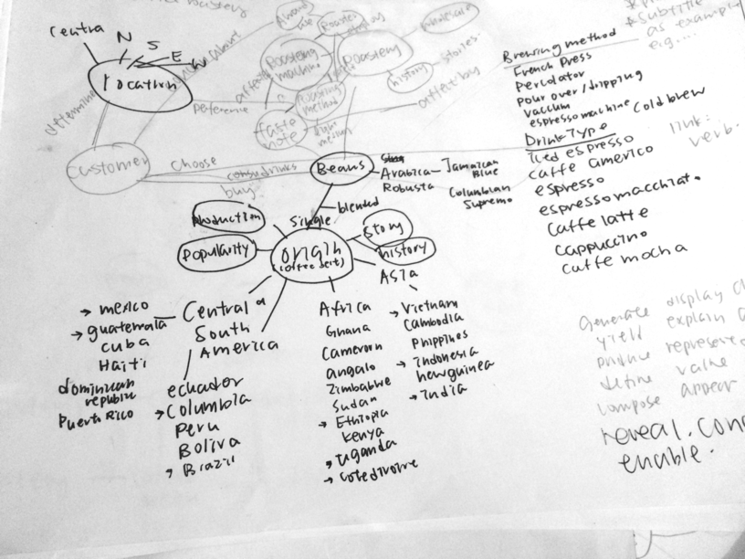
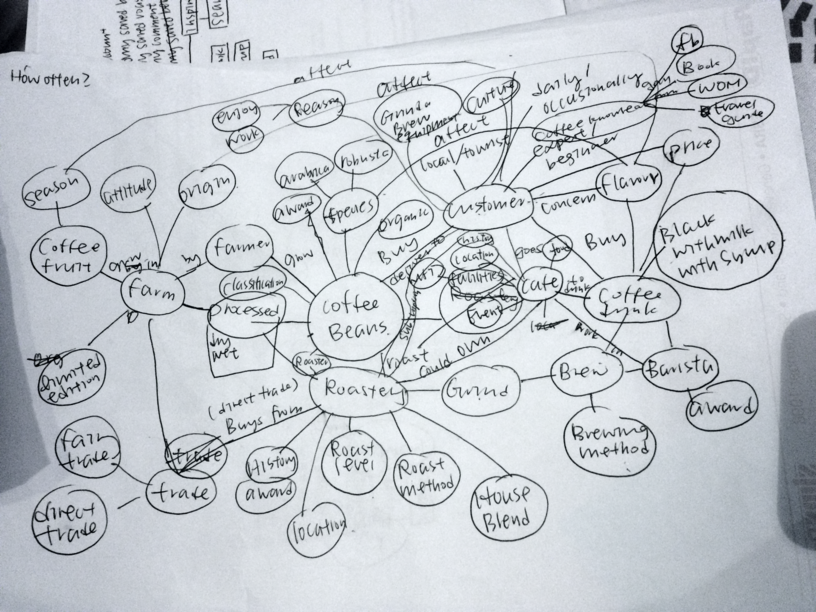
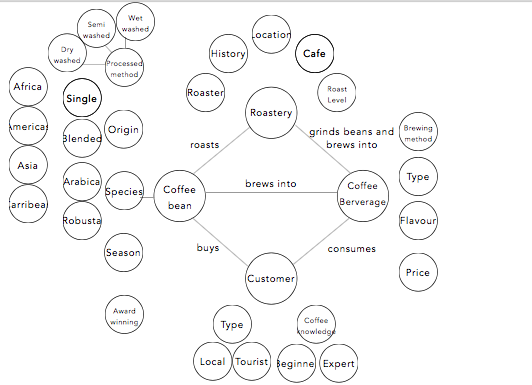
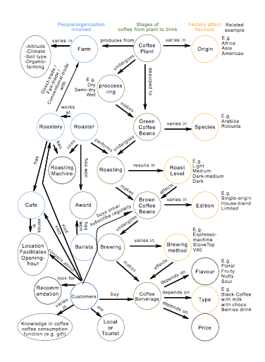
A domain model was created based on the interviews. There were a few iterations to effectively group and categorise the coffee knowledge.
Sitemap
Different mental model of categorising information was identified. Expert and novice users might have different ways to explore roasteries on the website. Therefore, the website should be able to support these variances.
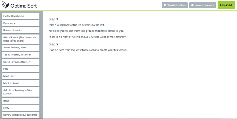
Open card-sorting from on online tool Optimal Workshop was used to understand the mental models.This analysis allowed me to create top categories and related information that were legible to most users.
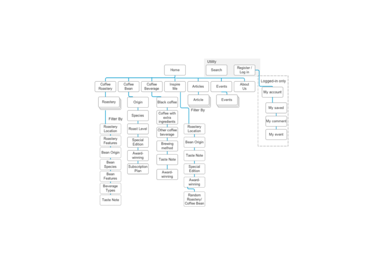
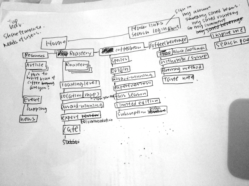
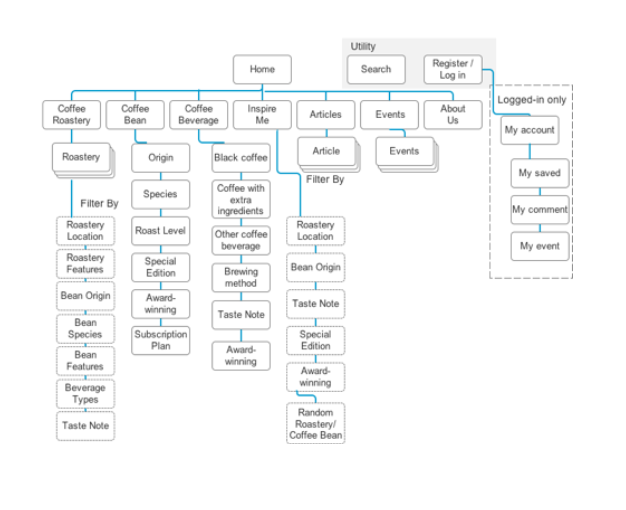
The navigation and categories were illustrated using a sitemap.
Persona and user journey
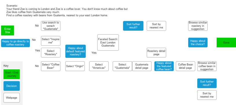
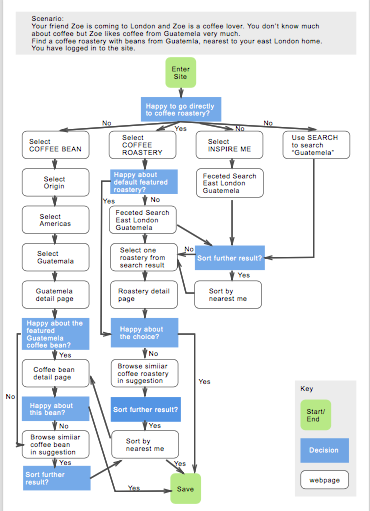
2 personas were summarised from the user research and represented their user journey when they searched for a target coffee roastery. A persona of sophisticated coffee drinkers and a casual coffee drink were created.
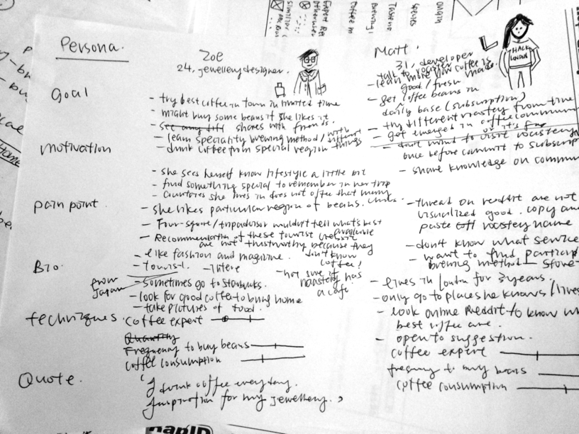
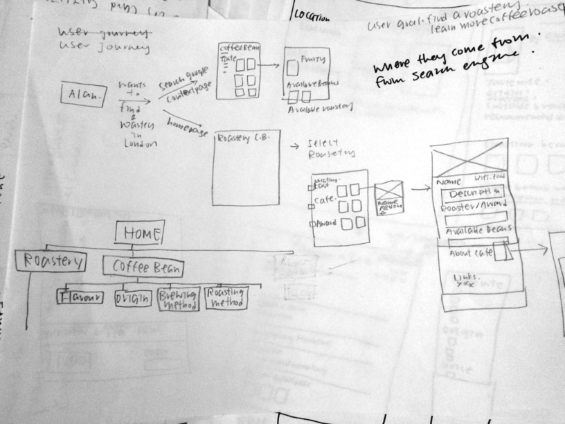
The user journey showed each decision point, related emotion and interaction of the persona when using the directory. I drew the user journey with the key page where users made decision, it helped me to imagine how users click each user interface element to achieve the goal. It also informed the wireframe design. The flow of user journey was iterated countless times to achieve most fluent one.
Wireframe
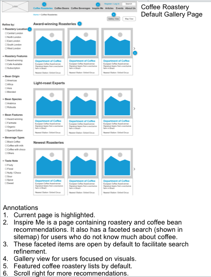
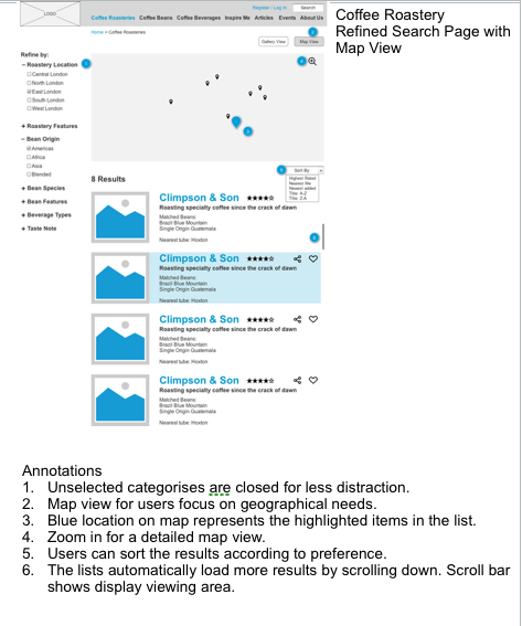
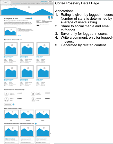
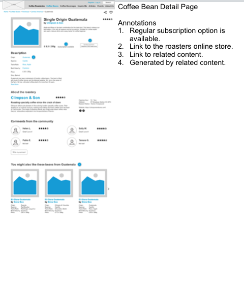
Wireframes were created in Axure. Search engines led users to land on the directory in multiple ways. The key screens from the user journey were designed to show how the information was presented to user.
Faceted search was supported to further break down the information into variables users might search for.
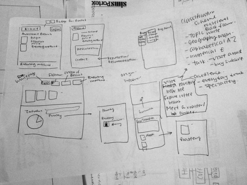
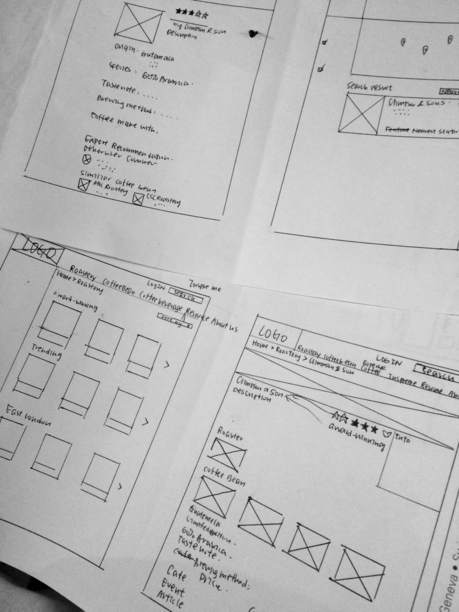
The design required a lot of knowledge of usability in user interface. It encouraged me to read around a lot of external material, from blog posts on Medium to book about search functions. The wireframe design evolved little by little every time. It illustrated below from rough sketch of main content to be informed, a straight grid-and-line one and finally to a digital one.
Evaluation
I evaluated the wireframe with 5 potential users, both coffee novices and experts alike. Both an exploratory and specific tasks were set.
I asked the participants to tell me what possible information they thought they could find under that global navigation. A specific task like “Find a roastery roasting Brazilian coffee beans in East London” was used to determining how well the information organised, labelled and navigated to potential users.
Although there are some minor navigation labelling issues, users can still find their content needs within the site. The other findings were summarised into future design improvements.
My roles
- User research - face to face and remote interviews, card-sorting
- Design - site map and wireframe
- Evaluation - conducted ThinkAloud user testing, completed evaluation report with design recommendations
