Cancer Research UK
Website | Charity | DistinctionProject overview
This was an individual project in the MSc HCID course to evaluate usability and user experience of the Cancer Research UK website.
The first part was a competitor analysis in terms of usability, functionality, appearance and brand identity. It followed by an evaluation via a 5-second test, click test, interview and moderated usability testing with users.
Process
Competitor Analysis
The competitor anlaysis allowed me to understand how users interact with similar websites, explore their functionality and design and gain insight of how usability could be improved.
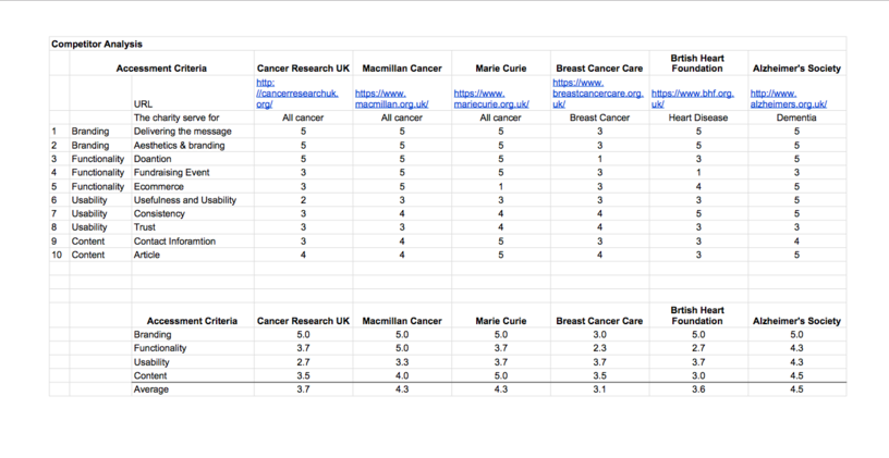
Ten criteria were chosen to review 5 direct and indirect competitor websites, categorised into four key areas of user experience; branding, usability, functionality and content.
Usability Evaluation and Result
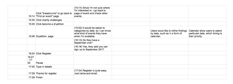
The usability evaluation aimed to investigate visitors’ impression of the homepage and usability of the shopping and fund-raising events sections. A pilot test was conducted to ensure test appropriateness and validity of results. Relaxed Think Aloud was used to probe participants to externalise their thought and actions. The researcher probed the participants for further explanation and clarification when needed.
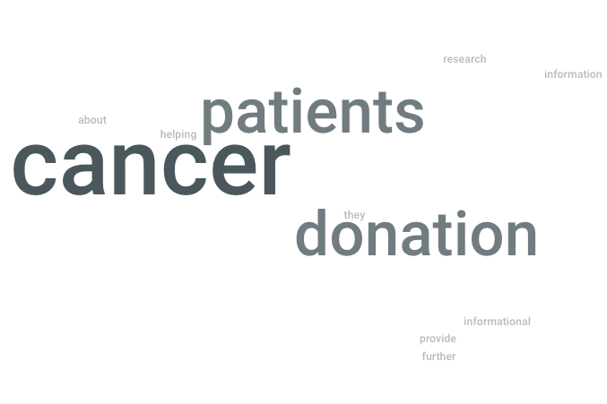
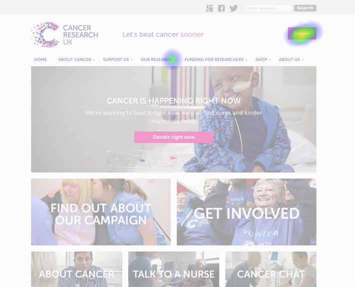
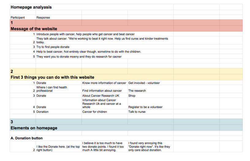
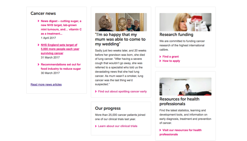
The homepage evaluation was conducted via a 5-second test, click test and interview. Participants were asked their opinion of the page’s visual elements, their understanding and feelings, their preference and overall impression of the homepage.
Participants in general appreciated the visual design and brand consistency. However, they experienced information overload and a negative impression from excessive donation click-to-actions.
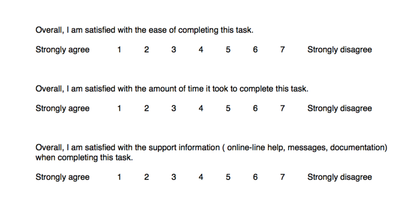
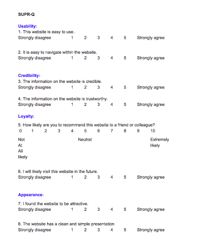
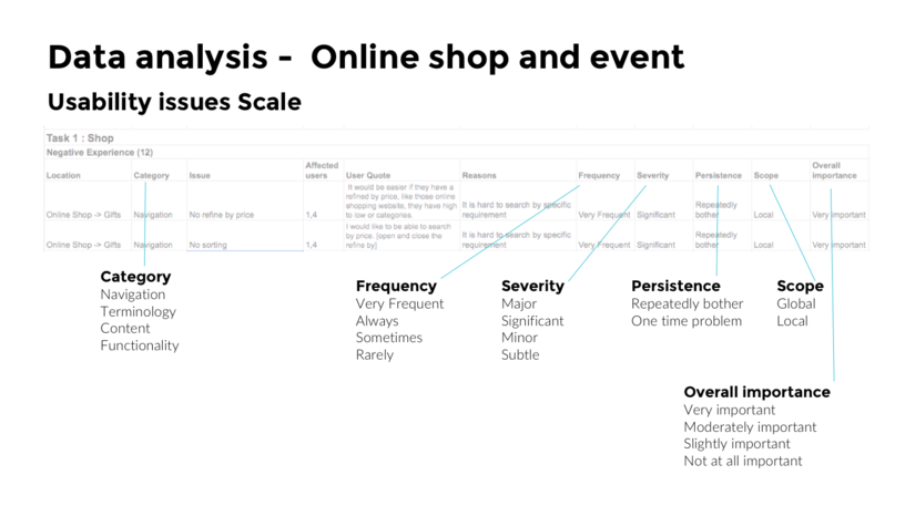
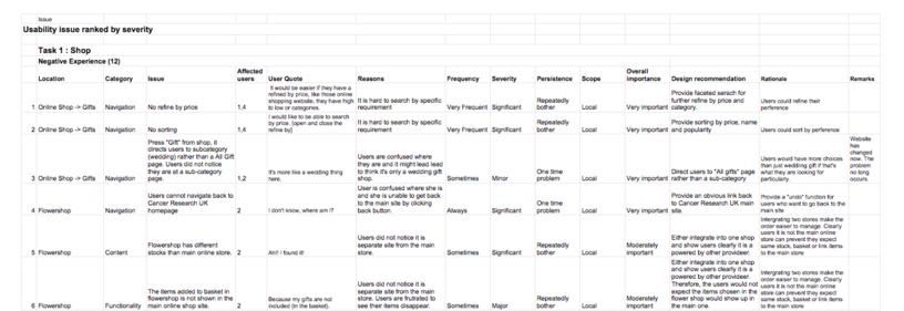
The shop and event pages were evaluated through tasks and questionnaires. Participants were asked to perform a verb-based task and scavenger hunt task in a realistic scenario. Results were analysed and classified into usability issues according to their impact and severity. Quantitative usability metrics including task success rate, task time, task level satisfaction (by ASQ) and test level satisfaction (by SPUR-Q) were also collected.
12 and 15 usability issues were found in shop and event page respectively. Navigation was the most severe problems, followed by functionality and terminology. Compared to other websites, trust is a strong element in Cancer Research UK website. Loyalty, usability and appearance were relatively low. This owed to the website’s information load and unappealing ecommerce section.
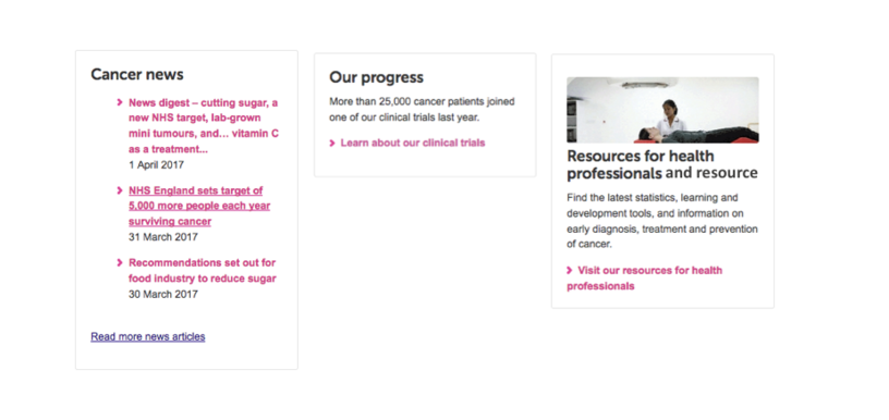
A ten minute presentation of design recommendations along with a highlight video emphasising users’ pain points was produced. In summary, a rearrangement of the information on homepage was suggested to create a clean and uncluttered look. Faceted search, sorting and ordering mechanisms would allow users to navigate to desired products and events easier. Clear navigation clues were provided to inform users of their current location and future actions.
