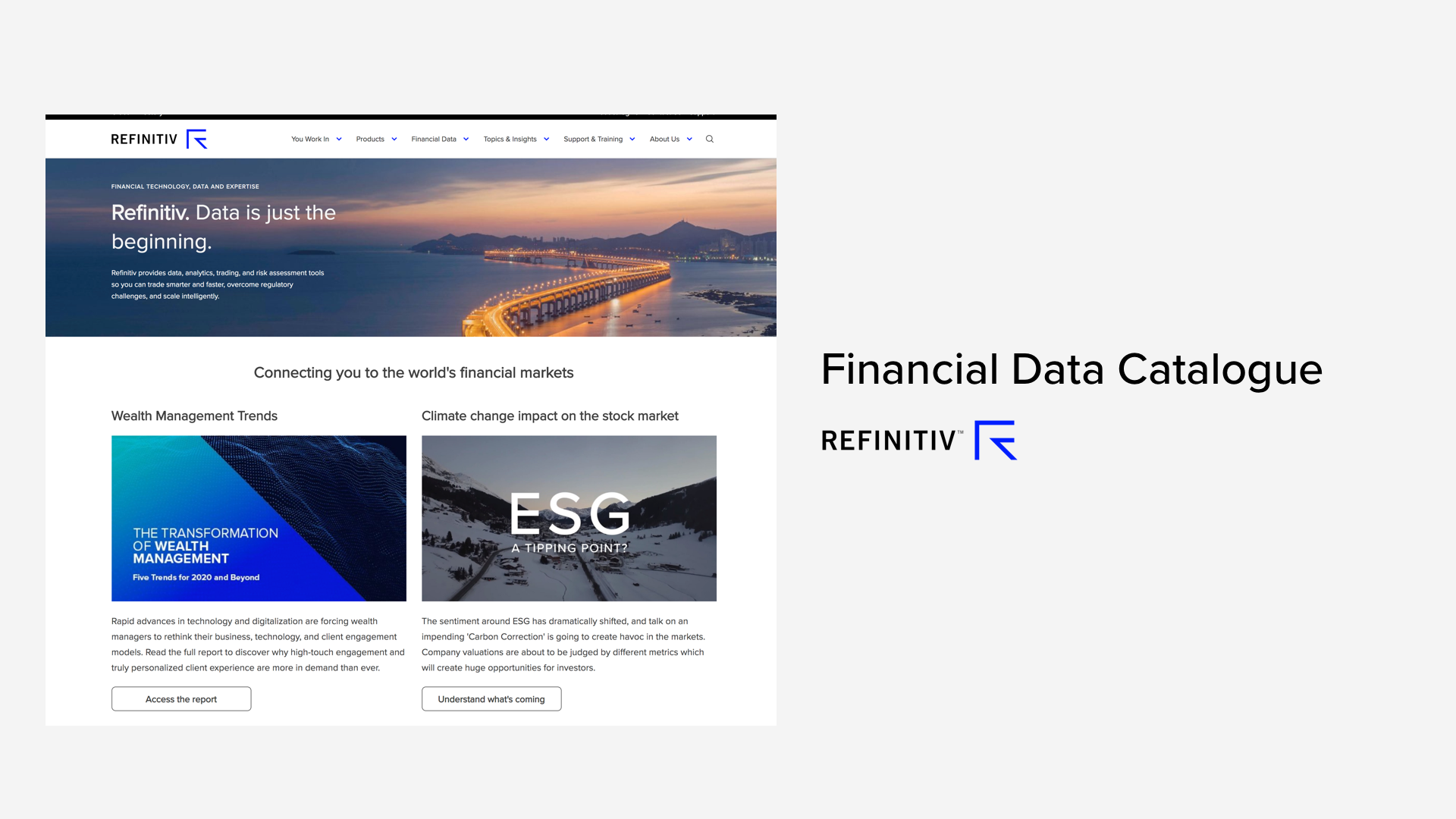
Financial Data Catalogue
Finance | Marketing | SEOProject overview
Data is the beginning. It empowers customers to make informed decisions. While Refinitiv is one of the leading financial data companies, its current marketing pages are insufficient in communicating the depth and breadth of data Refinitiv has.
This project aims at delivering a searchable and filterable data catalogue with a transparent and rich description of Refinitiv's data services to ensure customers are well-informed before engaging with the sales team. The aim of phase 1 is to generate quality leads and drive revenues, with the future goal of enabling customers to purchase data directly online.
I'm the lead user experience designer for this project, from ideation to implementation.
Content plays a crucial part in educating and enticing customers. At the back of the house, content is also important for search engine optimisation (SEO). Therefore, I started the project with content-first strategy, with holistic user interface and system design thinking.
This project is currently at the final stage of development to be reviewed by stakeholders and a small group of customers. Its due to be launched in Q1 2020.
Process
I collaborated closely with visual designers, developers and the senior business management team in this project. We each located in different regions (United Kingdom, United States, India) and used digital tools like Microsoft Teams to collaborate.
Design vision
Before starting the project, I collated insights from previous customer research and service design blueprint, and scrutinised customers' pain points for opportunities in data discovery. This research highlighted a real customer need, which allowed me to form a design vision for this project.
How might I explore the financial data from Refinitiv?
Design strategy
In order to identity any opportunity for Refinitiv to stand out from the competitors, I coached the design intern on analysing multiple competitors, both direct and indirect, to evaluate the interaction and visual element of their data catalogues. We found out most of our competitors did not have a clear path to find their data nor comprehensive details about their data.
We set the design strategy with the business owners to be a "Show not tell" data catalogue with easy navigation.
As I was unfamiliar with some of the technical jargon, I collaborated with subject matter experts to create a domain model of financial data together. This allowed me to speak the same language as our customers and stakeholders. It would also prove useful when designing search and filters later in the project.


Information needs
To digitalise a workflow, the first thing was to understand how it worked offline. I interviewed account managers and the sales team to walk through their selling process. The presence of product owner in these sessions helped to leverage the same understanding of the pain-points and customer needs. And now customer voices became louder as I had a strong advocator ally.
Do you have this data? How can I get it? How much is it?
From our research, these were the most common questions customers asked.
I reviewed the findings with the content management team, prioritising new content to be written where required.
Simple interaction
People typically have two types of information gathering strategies: browsing and searching. Collaborating with a visual designer on the whiteboard, we drew and iterated on divergent solutions to satisfy both needs.
We digitalised the designs in Sketch and shared with subject matter experts and account managers who worked very closely with the end-users. From feedback, we determined the search experience was more intuitive and better-fit with customers' circumstances. In a financial practitioners point of view, every minute counts. They had a concrete idea on what they want and do not spend time browsing. This hypothesis was later confirmed by user research.
After confirming the strategy, I sketched out the whole user journey and focused on the detailed element on each webpage. This helps me to understand where the customer might land on from search engine, and where the customers can continue the journey to find specific details.


Did customers find what they want?
Now it's time to validate the design, visual designer and myself created an interactive prototype in Invision. To minimise bias, I worked with an external research agency to formulate the research questions. They interviewed 20 customers from around the globe, both existing and prospective, in job roles that fit with our key customer persona. End-users such as traders wanted to see how data worked, market data managers were concerned with infrastructure and decision makers cared most about price.
The Refinitiv ecosystem is split into different portals by customer role. I put on my road builder hat to create highways to join the dots and direct customers to find their answers. Apart from page content and interaction, this signage piece was key to validate.

In general, the customer research confirmed that the interaction was intuitive and information was useful. They were eager to contact sales to learn more.
It also proved some of our hypotheses wrong. Customers did not like the description on the card, instead preferring to see Refinitiv's offering at a glance. Compared to other e-commence websites, which consist of appealing images and flattering descriptions, our customers wanted concise data schemas and expressed the desire to test directly.
The "Show not tell" strategy achieved the first step of discovery but it required stronger content in evaluation. I reviewed the feedback with the business, refined the design and raised new content requirements.
Building the bricks
The blueprint was finished, the actual build work started. I worked with solution and information architects, the financial content management team and SEO experts to design the backend solution.
To entice customers and optimise search engine rankings, information must be well-structured and easy-to-understand by both human and machine. The content we crafted was not only the page copy, but also taxonomy, metadata (keywords, synonyms, tags) and code.
Google is not going to crawl this.
One day our SEO expert commented on the sprint review. We all panicked. How would customers find us?
The card component was developed in React. Our SEO expert explained JavaScript components are not well supported by search engine crawlers. Some of the sub-category pages were still work in progress and so the linkage between related concepts was missing.
The whole team immediately gathered together, sketched and explored options, discussed every few hours to see if something could solve the issue quickly. I discussed the content requirement with SEO experts and provided few design options on how to remedy the poor rendering.
In the end, we agreed to develop two static content sections using existing components to describe benefits and sub-categories. This approach not only resolved the technical issues for search engines, it also provided more information and routes for customers that might interested to explore more.
Summary
The development work is almost finished and the project has been reviewed by stakeholders. Overall, the feedback has been positive and they were amazed by the achievement in such a short period of time. After another round of customer usability testing, it was launched in Q1 2020.
Challenges
Where is the quality content?
Only high-level descriptions of the financial data was available and its format was inconsistent. It took time to validate which information impacts customers and how to highlight important content. To alleviate this, I partnered with marketing team to create content guidelines to instruct content managers on how the brand wanted to communicate.
Financial data is complicated
Unlike groceries or clothing, financial data concepts are complicated. Additionally, data is multidimensional that it can be viewed from a high-level overview, to detailed data schemas depending on the customer role. The design had to be flexible to accommodate this.
Secret sauce vs customers' curiosity
How might we balance the customer needs to evaluate data and the business needs on protecting content from competitors? There was a constant negotiation on how much we could show on the unauthenticated site.
Takeaways
Design for future-proof and scalability
The content creation is still a work in progress. We have designed a flexible authoring template to allow content owners to adjust components based on content availability.
Sorting by "Recommended" is not recommended
Customers had negative feelings and critiqued the effectiveness of recommendation on an unauthenticated site. Financial practitioners often work in a niche fields and found the recommendations to be off-topic. We removed this sorting mechanism until the authenticated experience is in place.
Search is more than a search box
Search is about the metadata, headers, description, tags, keywords, site structure, URL and page index. I learnt a lot about creating better a search experience in Adobe Search, Promote and Database via insights from Adobe Analytics and Google Analytics.
Collaboration outside silos
Every team owned a small piece of the puzzle. To hold different pieces together, the project relied heavily on cross-collaboration, meeting notes and progress tracking. The product owner and myself were called the data catalogue twins because we were together for every meeting even in different office locations. I thoroughly enjoyed working on this project with an amazing team.